
Case Study · Personal · 2026
Plainly App
At a glance
The idea Co-parents live by a long agreement they read once. The answers they need are in it, just not in a form anyone can use on a Tuesday night.
- rules read from a fictional 28-page sample agreement, each citing its section and page
- 49
- automated checks keeping the rules engine honest
- 122
Product Designer · In testing
A divorce agreement is a static document describing a dynamic life. Plainly turns it into something a parent can actually use: what's coming up, what they owe, and what it says when they need an answer.
Problem
A divorce agreement and parenting plan decide almost everything about life after a separation: whose weekend it is, who has the kids for Thanksgiving this year, how much notice a trip out of state needs, who pays what share of an urgent care bill. Yet it lives as a PDF that most people read once, under stress, and then go back to only when something has already gone wrong.
I designed Plainly first for divorced dads, partly because I am one, and partly because the organizing that co-parenting demands doesn't come naturally to a lot of us. The voice had to stay neutral, though. Plainly helps people understand their agreement; it never takes sides or adjudicates it.
Opportunity
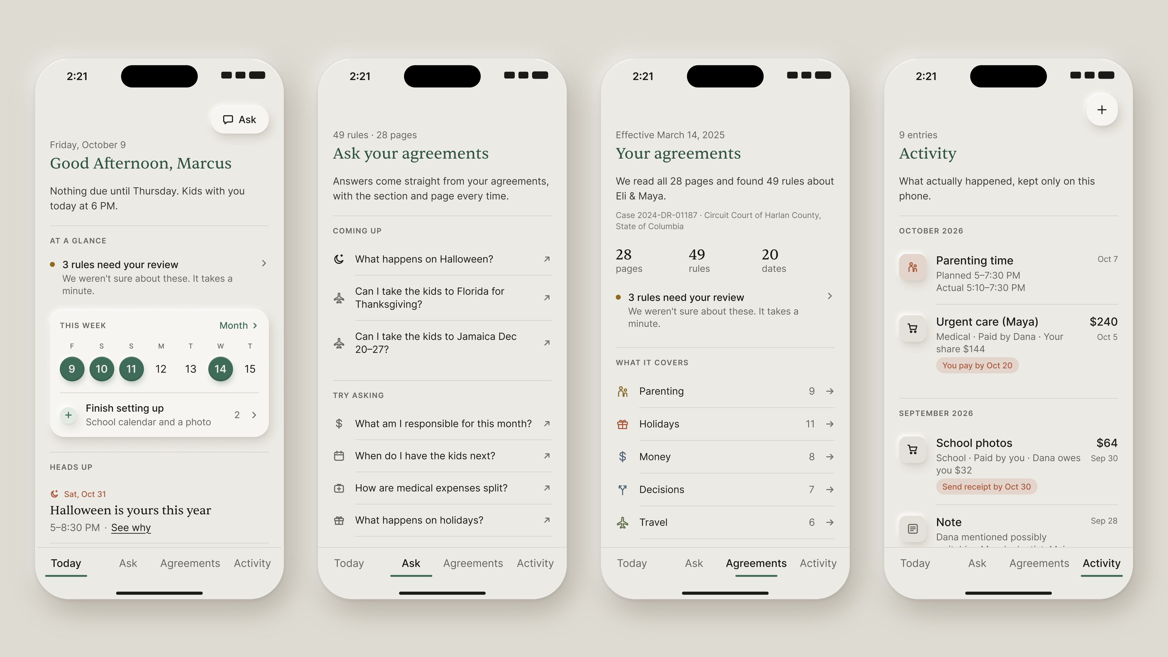
Instead of a better PDF viewer, the agreement could become a living system: something that knows the rules, notices the moments when they apply, and helps the parent act on them. That meant four simple places to go: Today for what's coming up, Ask for questions in plain language, Agreements for every rule grouped by topic, and Activity for what actually happened, kept only on the phone.
Exploration
The first working version was useful but felt utilitarian, and this is not a happy use case. I wanted it to read like a thoughtful letter rather than a dashboard, so the visual direction became quiet and editorial: warm greige paper, near-black ink, hairlines instead of tinted panels, and a single sage accent. There is no red anywhere, not even on destructive buttons. Sentient handles every serif moment (titles, reading text, numbers) and Inter handles the interface.
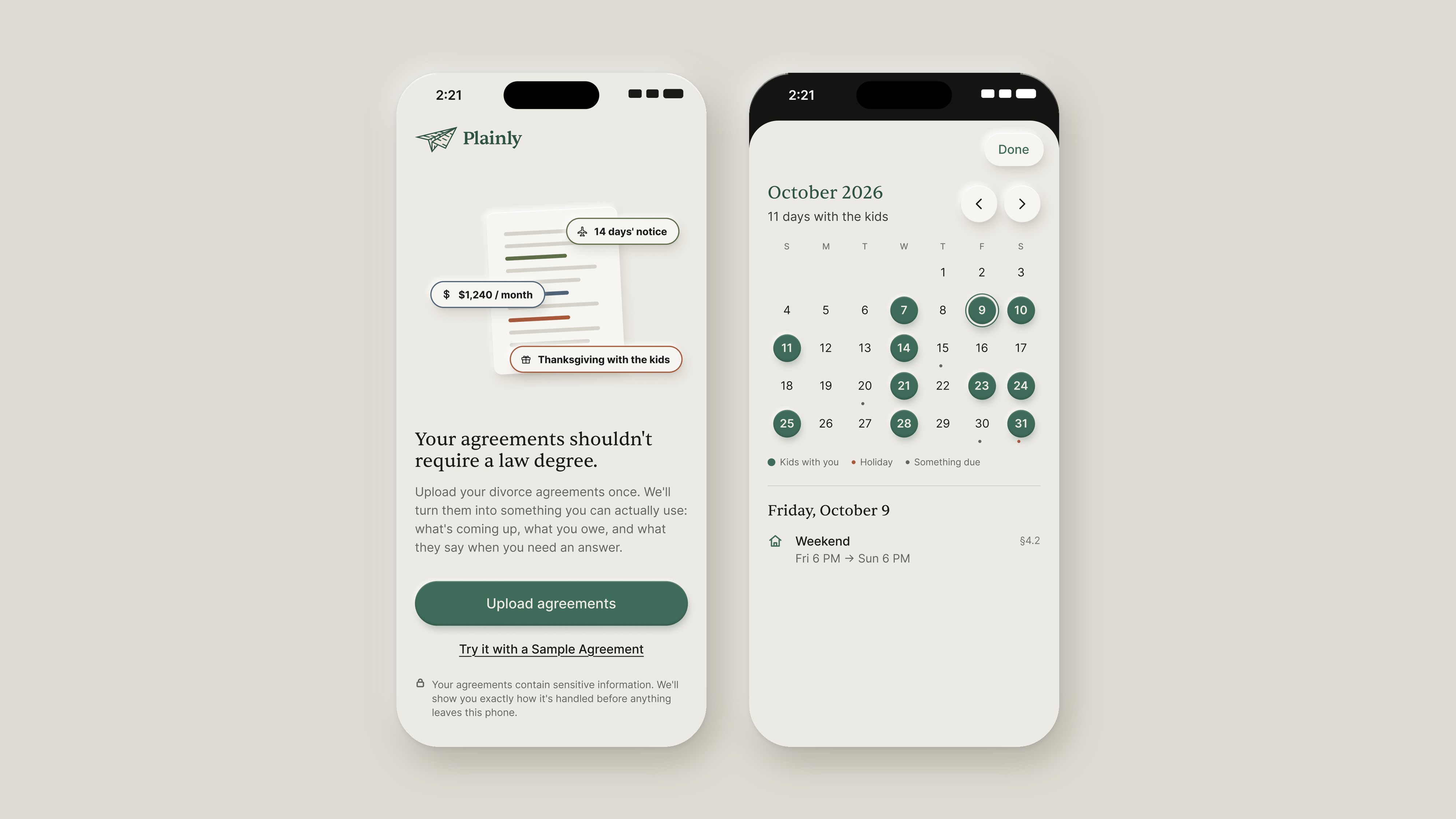
Small details carry the warmth. Tapping one of your own days on the calendar pops a quick celebration emoji in place of the date. A photo of the kids can sit behind the calendar. Copy says "Kids with you", never "Yours".
The name went through Clause, Kept and Guyd before landing on Plainly, which says what the app does. The mark is my own drawing: a paper airplane folded from an agreement, its printed lines still visible. I tried simplified redraws of it and kept the original. It pairs with the wordmark in horizontal and stacked lockups, and on the app icon it comes in sage, dark and light, the three colourways the 3D icon turns through.

Solution
Under the interface, the hard decision was where AI belongs. In Plainly a language model does only two jobs: it extracts rules from the uploaded agreement, and it turns questions like "Florida, Nov 25–29" into a structured plan. Everything after that is plain, deterministic code, a rules engine that works out who has the kids when, which notices apply, and what's due. Because of that, every answer can show exactly which sections it used. "Why am I seeing this?" is always one tap away, and it ends at the agreement's own words, on the right page.
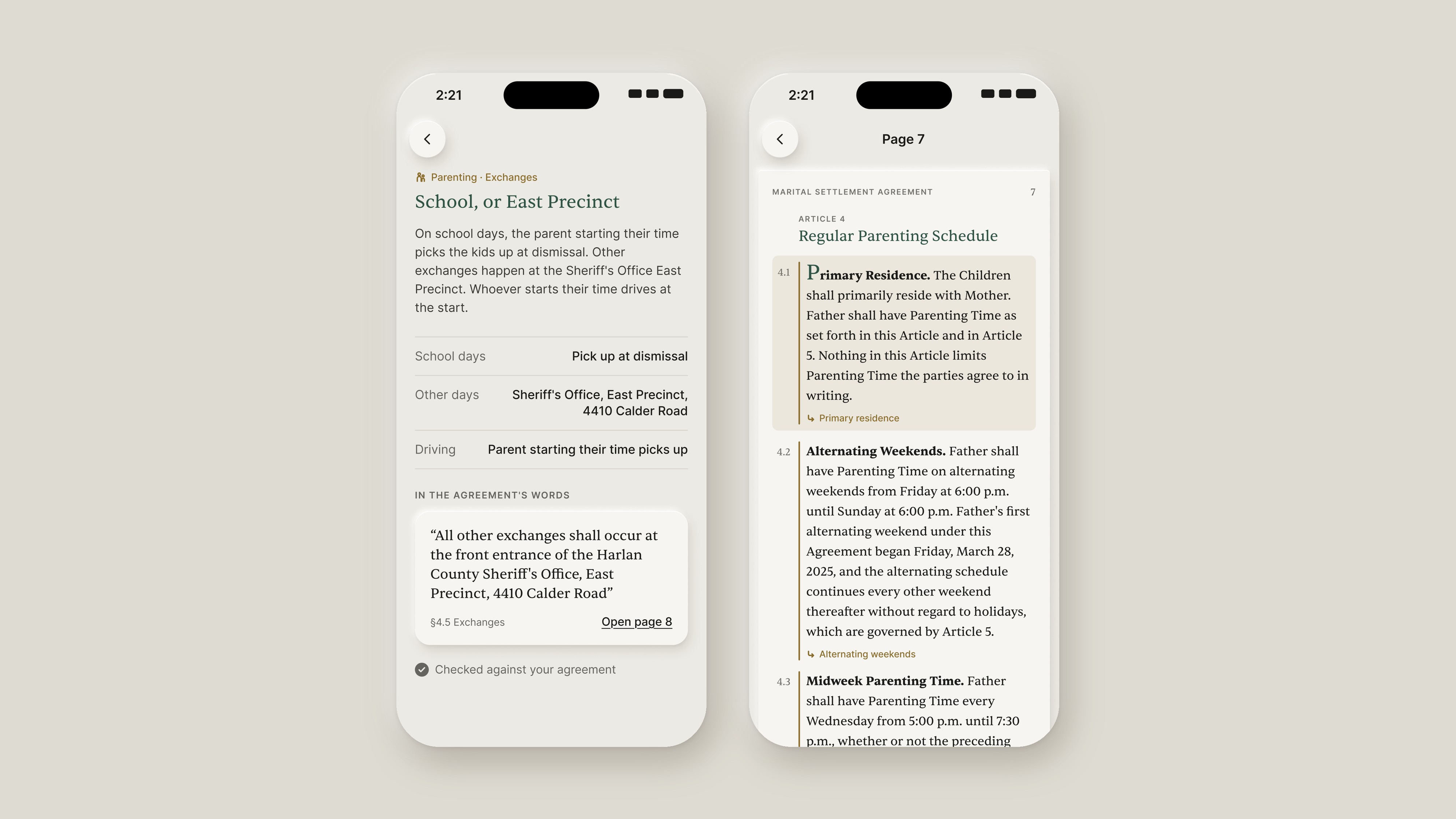
Rules the model wasn't sure about come back as proposals for the parent to confirm, and anything it reads wrong can be corrected. That second part came straight out of testing: the first time I uploaded my own agreements, it listed my ex-wife and me as the children, and there was no way to fix it. Editing people, holidays and parenting times followed the same day.
The first-run experience sets the tone. I built a short 3D animation in Blender for the Welcome screen: an agreement's key lines light up, lift off as glass chips ("14 days' notice", "$1,240 / month", "Thanksgiving with the kids") and the page folds itself into the Plainly paper airplane. It has light and dark versions, with a still image for people who turn on Reduce Motion.
Outcomes
- A working SwiftUI prototype covering onboarding, Today, Ask, Agreements and Activity, running on my own iPhone with my own agreements
- A rules engine that turns a fictional 28-page sample agreement into 49 cited rules, backed by 122 automated checks
- Real-world testing changed the design: reading mistakes are now expected and fixable, and "agreement" became "agreements", because most families live under more than one document
- Next: a v0 product spec and testing with other parents